
Can't find what you're looking for?
Start a conversation
Chat conversation only works if you have concented to all cookies. Modify your cookie settings here or send an email to team@twentythree.com
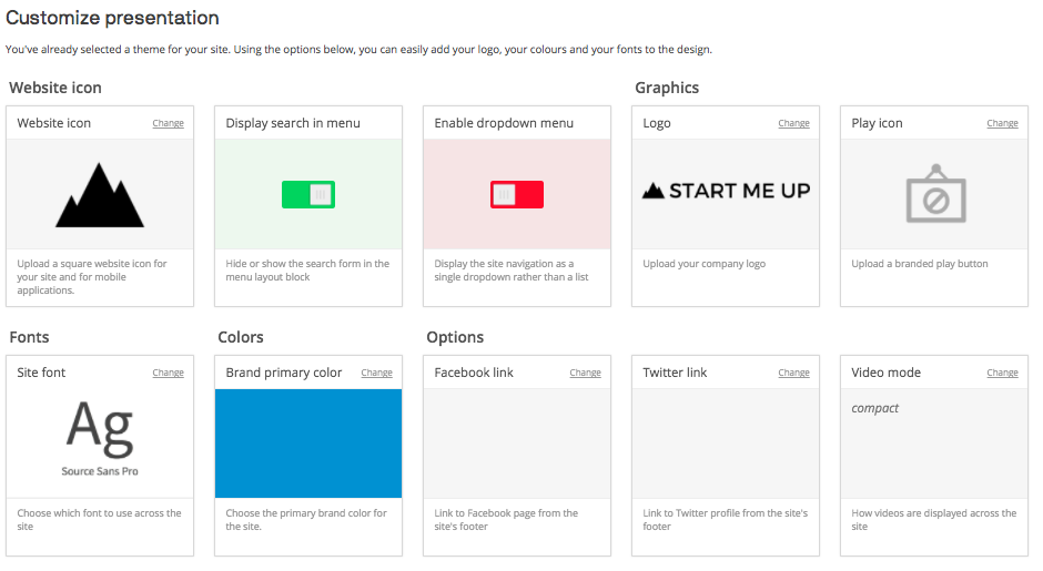
Using Theme options, developers can turn simple designs into customizable themes where ordinary users can modify logos, colours, fonts, and sizes in a structured fashion through a UI under Inbound → Customize theme, foregoing the need to edit any code.
Theme options can be created and edited under Site Designer → Theme options:
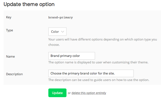
Upon choosing to Add a new theme option the user is presented with a form through which they configure the type and properties of the theme option they would like to create:
All theme options are made available to your Liquid templates in the format {{themeoption.keyname}}. If the option contains dashes, the key will be converted to camel case when used in Liquid.
All theme options are also made available to your Sass files precompilation in the format $key-name. This means that not only can you use these variables as you would expect in your theme stylesheet, you can also give your theme option the same key as a pre-existing Bootstrap variable such as $brand-primary or $body-bg and it will automatically take precedence over any values set by !default in Sass.
While this can be helpful in quickly developing on Bootstrap it does mean that you will have to bear in mind what you choose for the keys for your variables as you could end up overriding something you didn't intend to. For reference, we're using version 3 of the official Sass port of Bootstrap.
If you want to be able to reference theme options in JavaScript the theme options library has to be enabled in the Libraries section which is navigated to by going to yoursite.videomarketingplatform.co/presentation/libraries. On that page you are able to enable the theme options library:
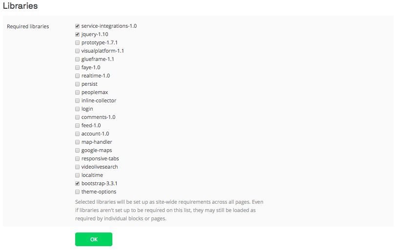
Once enabled the theme options are made available to JavaScript through an object accessible at window['visual']['themeOptions'] in the format window['visual']['themeOptions']['key-name'].
For example:
<tt>window['visual']['themeOptions']['brand-primary']
"#0093CE"
</tt>There are multiple different types of theme options available, each with appropriate customization options.
| Type | Description | Required properties |
|---|---|---|
| Boolean | Let the user select a true or false value through a toggle UI. Example:
Result: 
|
key, name |
| Color | Let the user select a color width a color picker − or input an RGB or hex code.
Example:
Result:  |
key, name |
| Font | Let the user select a font to use. The theme customizer has support for 22 fonts built-in. On selection of a font the key can then be used with *__font_import_url* or *__font_name* appended to obtain the import URL or name of the font respectively. The list is:
Example:
Result: 
|
key, name |
| Graphic or image | Let the user upload an image file which is then rescaled, converted and made available as resource file.
Example:
Result:  |
key, name |
| Text | Let the user input a piece of text or select from a predefined set of options.
Example:
Result:   |
key, name |
| Property | Description |
|---|---|
| Key | The unique identifier, which can be used to access the variable in Liquid, JavaScript, CSS and Sass. Only letters A-Z, numbers, underscores and dashes are allowed, and the key cannot be changed. If the option contains dashes, the key will be converted to camel case when used in Liquid. |
| Type | The type of information that we want to be saved by the option, choices contain Color, Boolean and Text for example, the UI presented to the user in the *Customize theme* options will vary depending on the type chosen in a way that makes sense, for instance selection Color will present the end user with a colour picker, while selection of Boolean will mean a toggle is displayed to select between True and False. |
| Name | A human readable name for the Option, for display in the final *Customize theme* options. |
| Description | An optional description for the option to provide further context. |
| filename | The filename and file type of the uploaded file or graphic. For example, if you set filename to logo.png, the uploaded file is converted to a PNG file and is available as a resource file at /files/logo.png. |
| min-width | When the users upload a graphic file, the image is rescaled and converted. min-width describes the minimum width of the file after it has been converted − if users upload smaller images, they will be scaled up. Note that this property is handled on the server; not in the browser. This means that you are not limited by legacy browsers such as Internet Explorer 6 and 7 that do not support min-width natively in standard CSS. |
| min-height | The minimum height of a uploaded and converted graphic file. See min-width for further details. |
| max-width | The maximum width of a uploaded and converted graphic file. See min-width for further details. |
| max-height | The maximum height of a uploaded and converted graphic file. See min-width for further details. |